
Urban look - light and airy
Prerequisites: This tutorial is aimed for more advanced photographers who are familiar with using Masks and Adjustment layers.
I recently made a tutorial showing how to achieve deep, dark colours. Now, let’s do the opposite! I will show you how to edit bright pictures and achieve a light, airy look, that looks perfect for urban sessions.
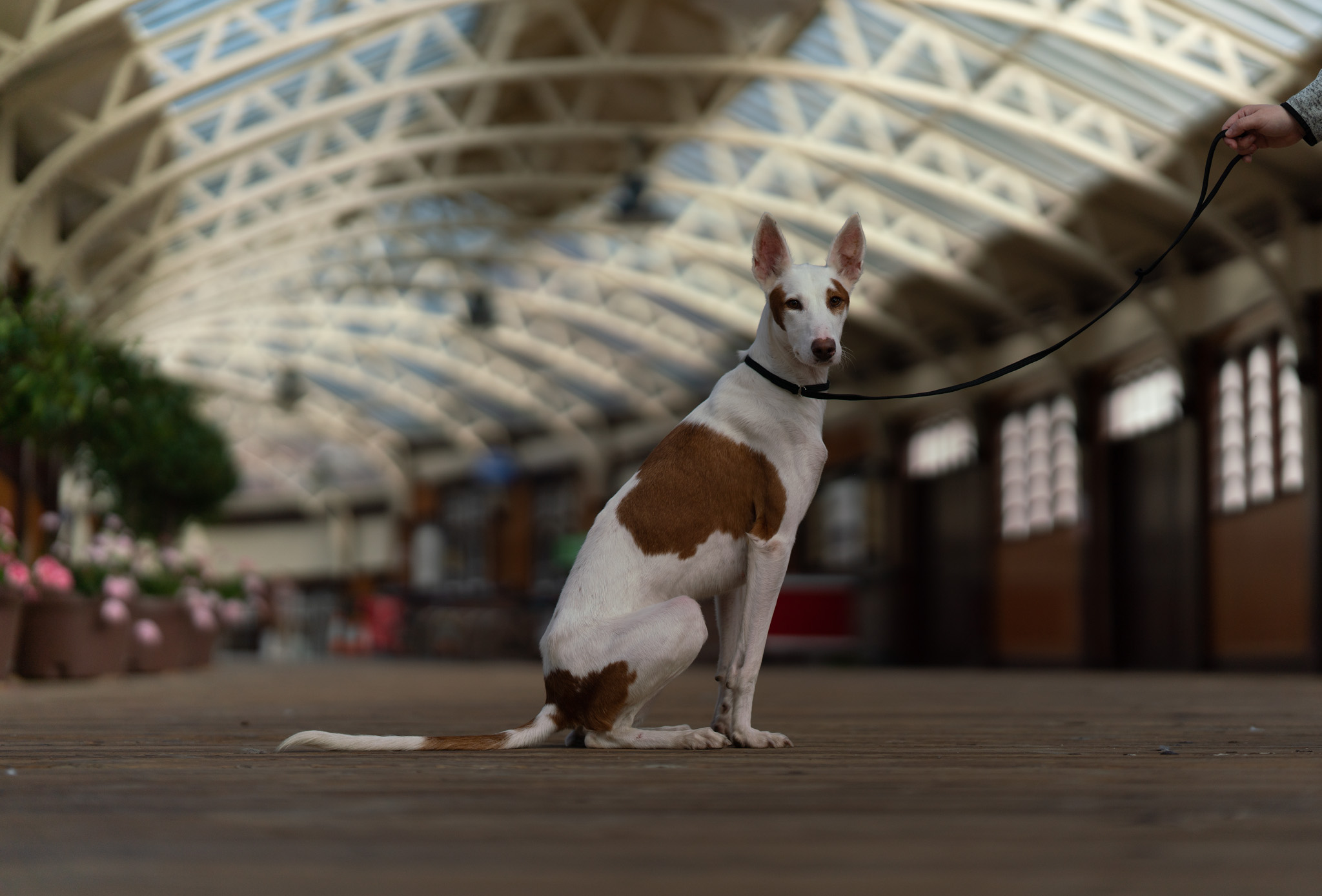
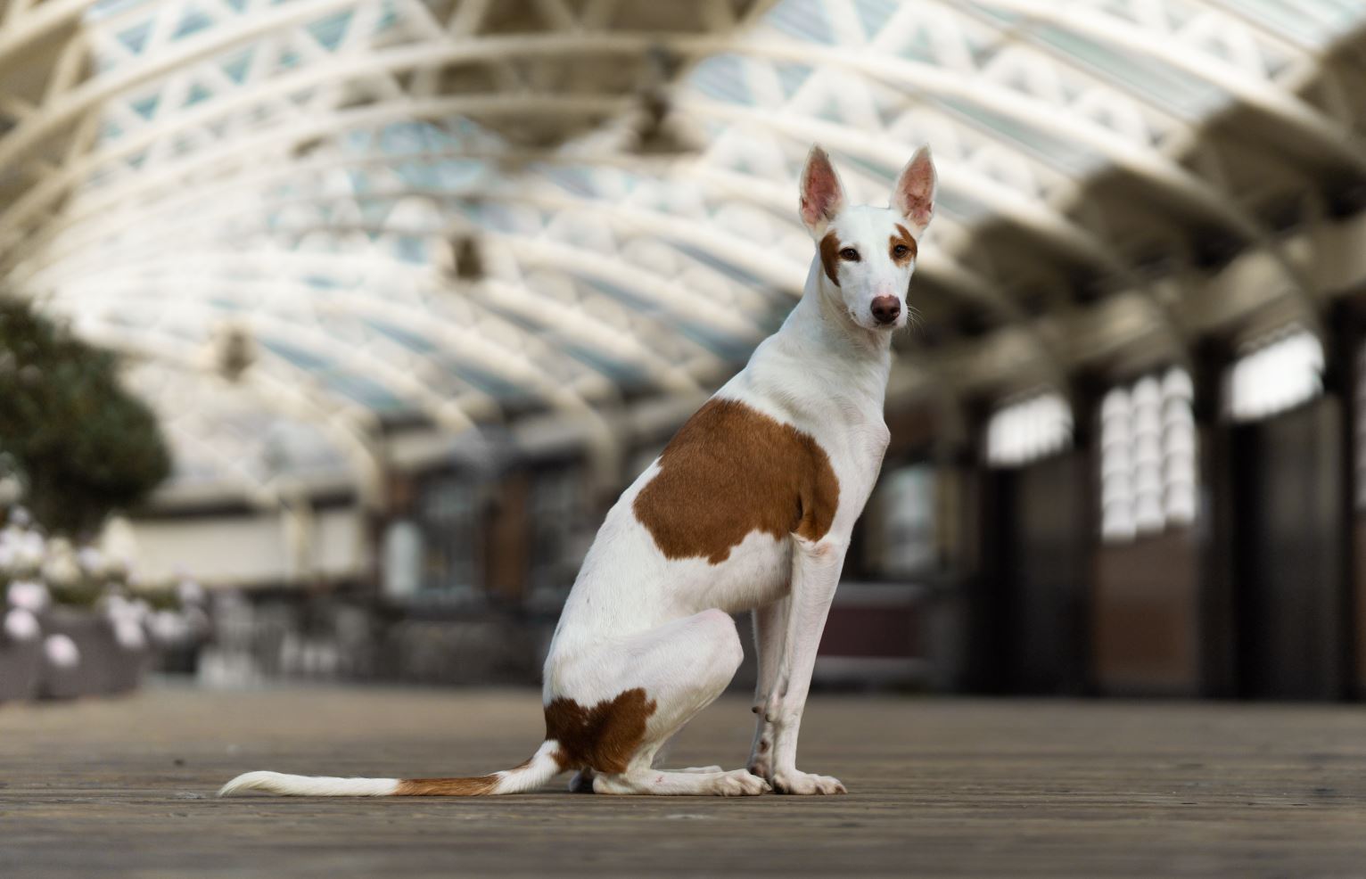
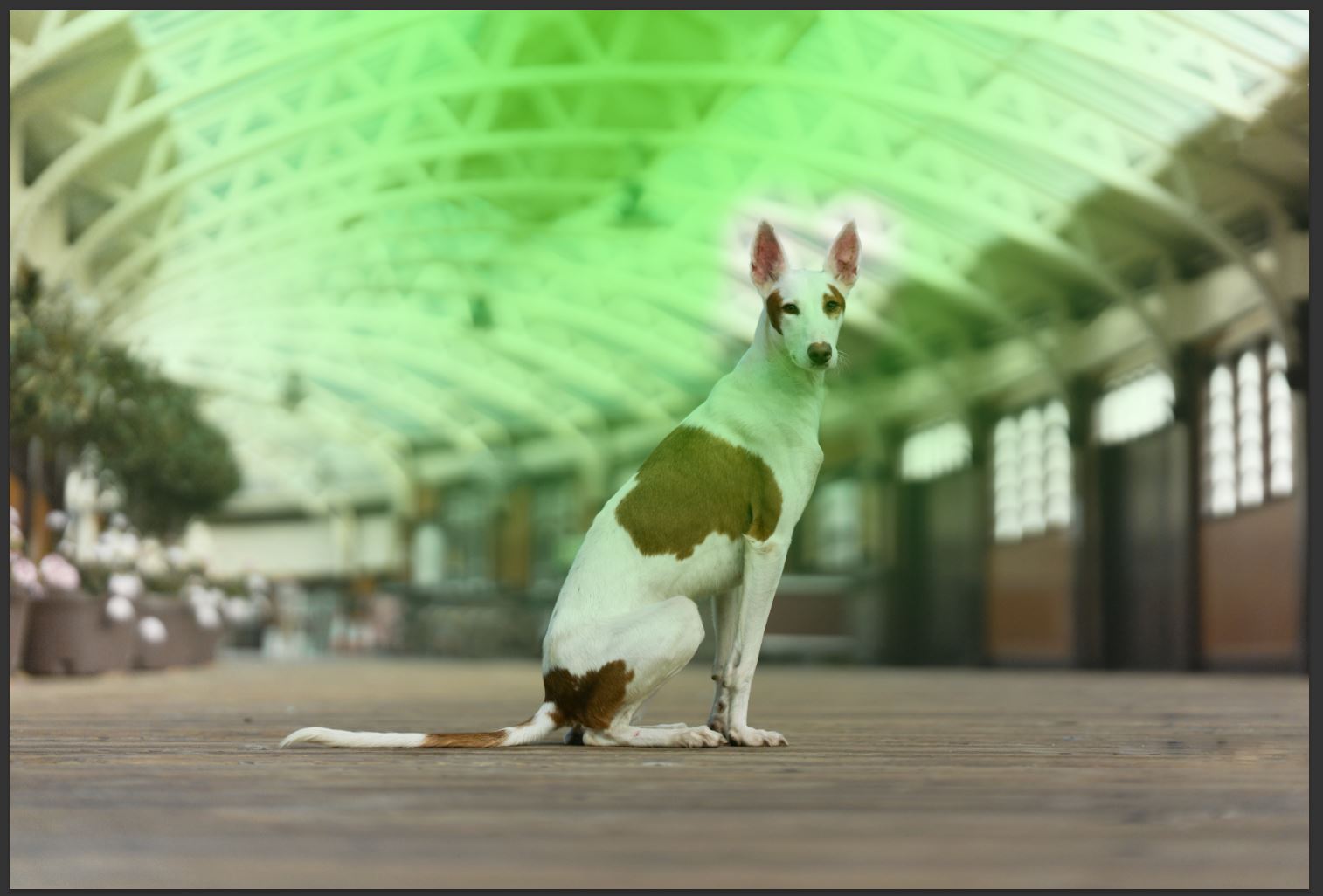
The first step is choosing the right photo for this type of edit. A bright coloured picture with shallow depth of field will work best. I chose an urban location, but I encourage you to experiment and try with different type of photos as well. Perhaps a foggy meadow or a beach shot?
Raw processing
When it comes to pictures with bright elements and light coloured dogs, I tend to underexpose a bit, to make sure the bright areas are not blown out. Some cameras offer dedicated metering types, that will set the exposure to protect the highlights. Remember, you can always recover “something” from the shadows, but if it’s blown out, that’s game over.
In Lightroom, I correct the overall the brightness, by modifying the Exposure slider. I also reduce highlights if necessary, again, to avoid any blown out areas. Pay attention to the highlights, it’s very easy to overdo it. Keep it natural. At this point, I also modify the White Balance, if necessary. In this case, I like the slightly warmer WB, because I think it matches Phara’s brown fur spots. For grey/black dogs, I would go for a cooler white balance and try to achieve a blue/grey tones in the darker areas, but it’s all up to you!
Desaturating vibrant colors
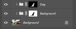 Now, let’s move to Photoshop. All the steps will apply to the background only from now on. I typically create a new folder in the Layers tab and apply a mask to the folder. This way I can keep adding new adjustment layers without having to re-apply the mask on every single one of them. I will cover masking methods in a future post, but one of my favourite tools is Topaz. I also skipped removing the leash in this tutorial.
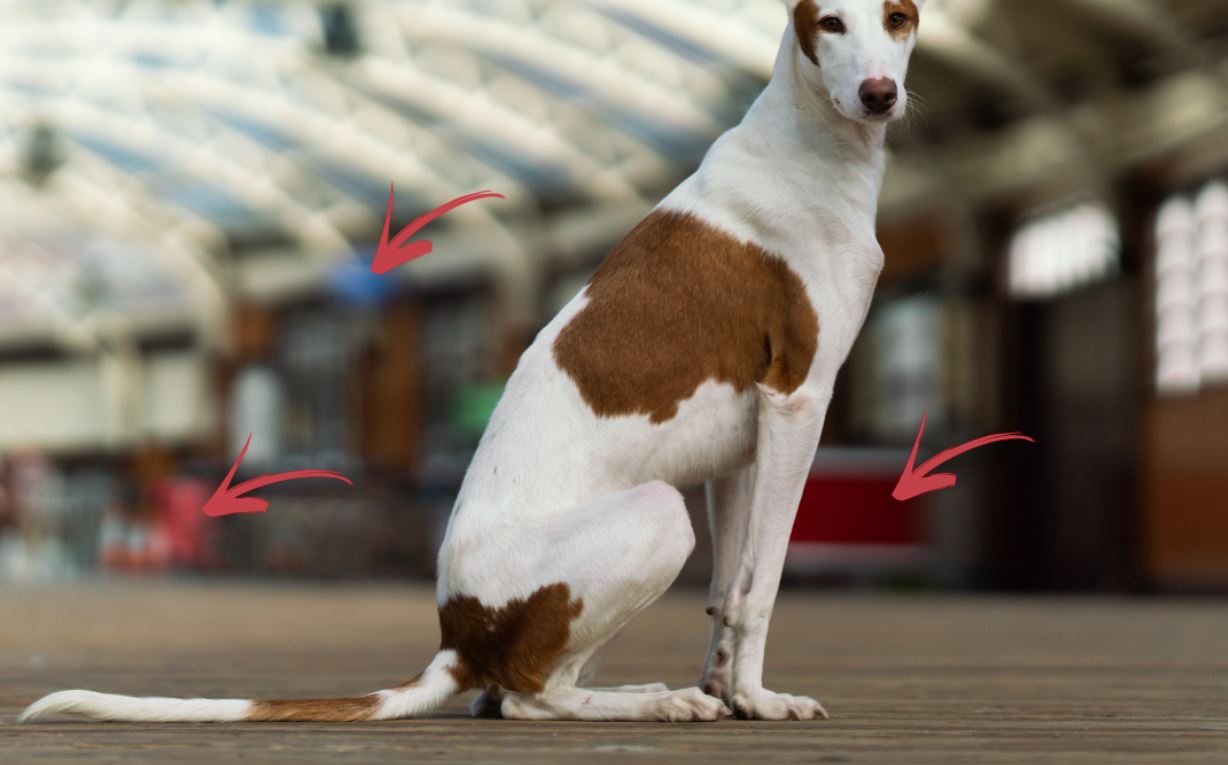
In many cases, especially when shooting in urban locations, you might find a lot of distracting objects in the background. Bins, signs, people – it can all be very distracting and grab the viewer’s attention, so I definitely want to get rid of them. In most cases, especially when the background is blurred a lot, desaturating does the trick and cloning is not required.
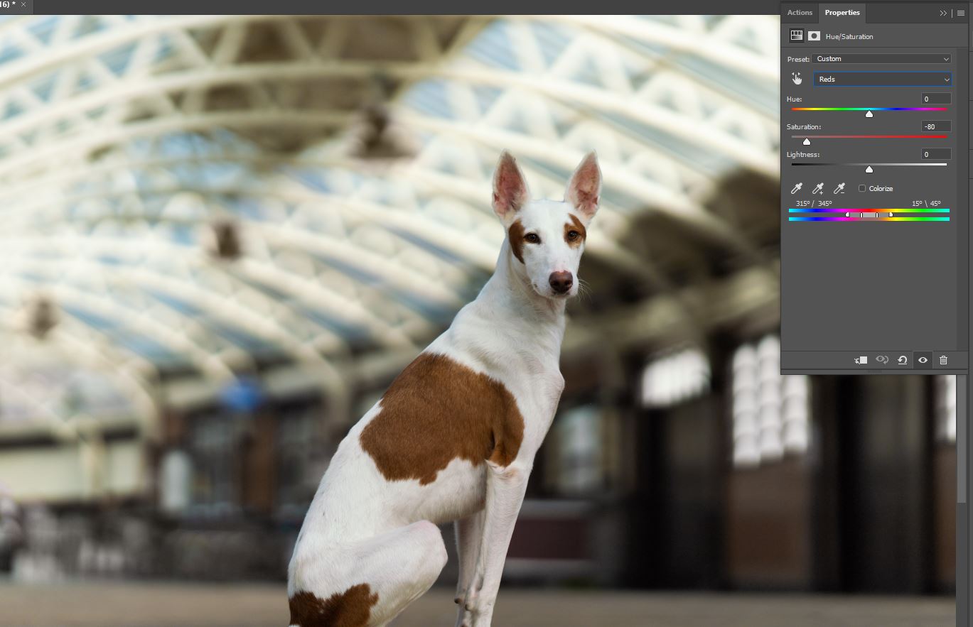
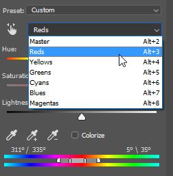 Let’s start with desaturating the red tones. I usually do this by adding a new Hue/Saturation/Luminance (HSL) adjustment layer. By default, the HSL is set to Master, which means it will affect all the colours. Let’s change the selection to ‘Reds’. Notice, that a small slider appeared in between the color bars. The outer triangles control the ‘feathering’ or ‘color fall off’ and the bars represent the selected color range. Change the Saturation first, by moving it almost all the way to the left, so the reds are almost fully desaturated and see how it affects your photo. Adjust the color range and saturation if necessary.
The goal is to make any vibrant colors less distracting, but not completely grey. Repeat the same process for any other colours in you photo. In my case, I had to add Green and Blue HSL adjustment layers.
Shaping the light
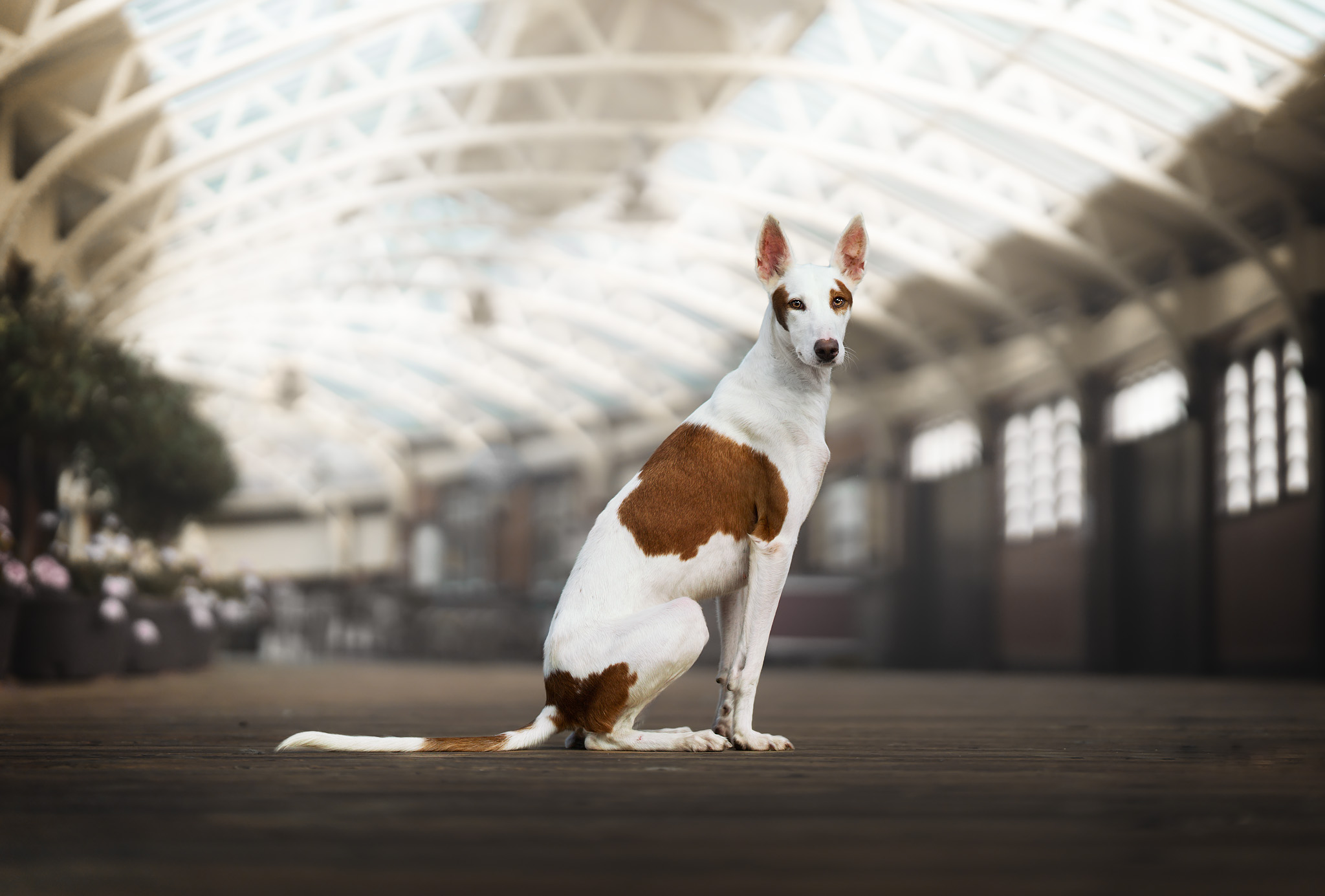
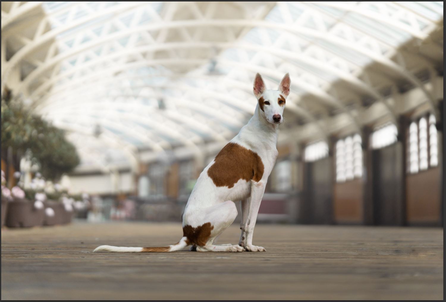
After cleaning up the background, I can finally start shaping the light in the background. This is the key step to creating the airy look. I use a combination of Curves and adjustment layers – Soft Light and Hard Light. All the adjustments are applied to the background only.
Curves
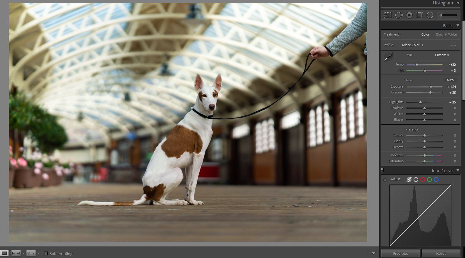
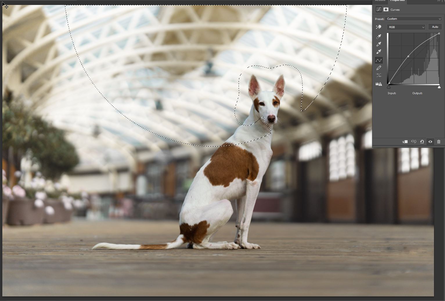
I usually start shaping the light in the background by adding a new Curves adjustment layer. The goal is to make the background lighter and reduce the contrast. To do this, lift the left side of the Curve to brighten the darkest parts of the background (see screenshot) and reduce the contrast. If the background feels too dark, adjust the right side of the Curve very slightly – lifting it too much will introduce too much contrast.
At this point the background should already look quite smooth. However, make sure that the dog blends well and doesn’t stand out too much. Overdoing this step might make the dog look like she’s been pasted into the image.
Next, I add a second Curves adjustment layer, to create the fake light flare. I use a very soft and large brush to create a mask at the top of the image. See the screenshot – the green selection shows my masked areas. Notice, that I left the areas around the ears unpainted – they are bright coloured and I did this to avoid blending the ears with the background too much. I lift the Curve in the middle to brighten my selection and add a subtle light effect.

Soft Light and Hard Light
The next step is making some finer adjustments by adding two new layers. I add the first layer and the the blending mode to Hard Light and for the second layer I set the blending mode to Soft Light. Those blending modes are quite similar, but the key differences are:
Hard Light
- painting with pure black or white results in pure black or white.
- reduces contrast
Soft Light
- painting with pure black or white produces a distinctly darker or lighter area, but does not result in pure black or white
- adds contrast
I plan to cover these blending modes in more detail in a separate post, but that should be enough for now, to give you some ideas on how to use them. The main goal is further simulate the light shining through the roof, so I mainly paint at the top of the photo.
I start with Hard Light layer and paint over the areas that I want to brighten with white soft brush set to around 2-3% opacity. Notice the darker part of the roof direct above the dog – after painting over it it’s no longer so distracting.
Then, I switch to Soft Light layer and start painting with a large soft white brush set to around 10-30% opacity. Again, the goal is to simulate the light shining through the roof, so I focus mainly on the top part of the image. Then, I switch to a dark (either black or very dark brown brush) and paint a bit around the edges at the bottom to add a very subtle vignette.
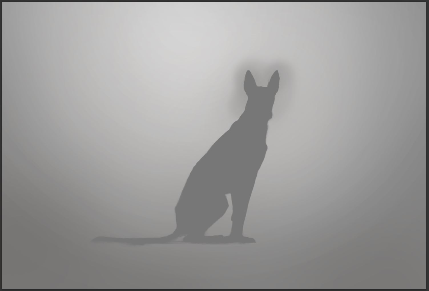
Have a look at the last screenshot – it shows all the areas brightened or darkened with Curves, Soft Light and Hard Light layers.

Background - finishing touches
The last steps in editing the background are adding a vignette and applying the Orton Effect. Let’s start with the vignette.
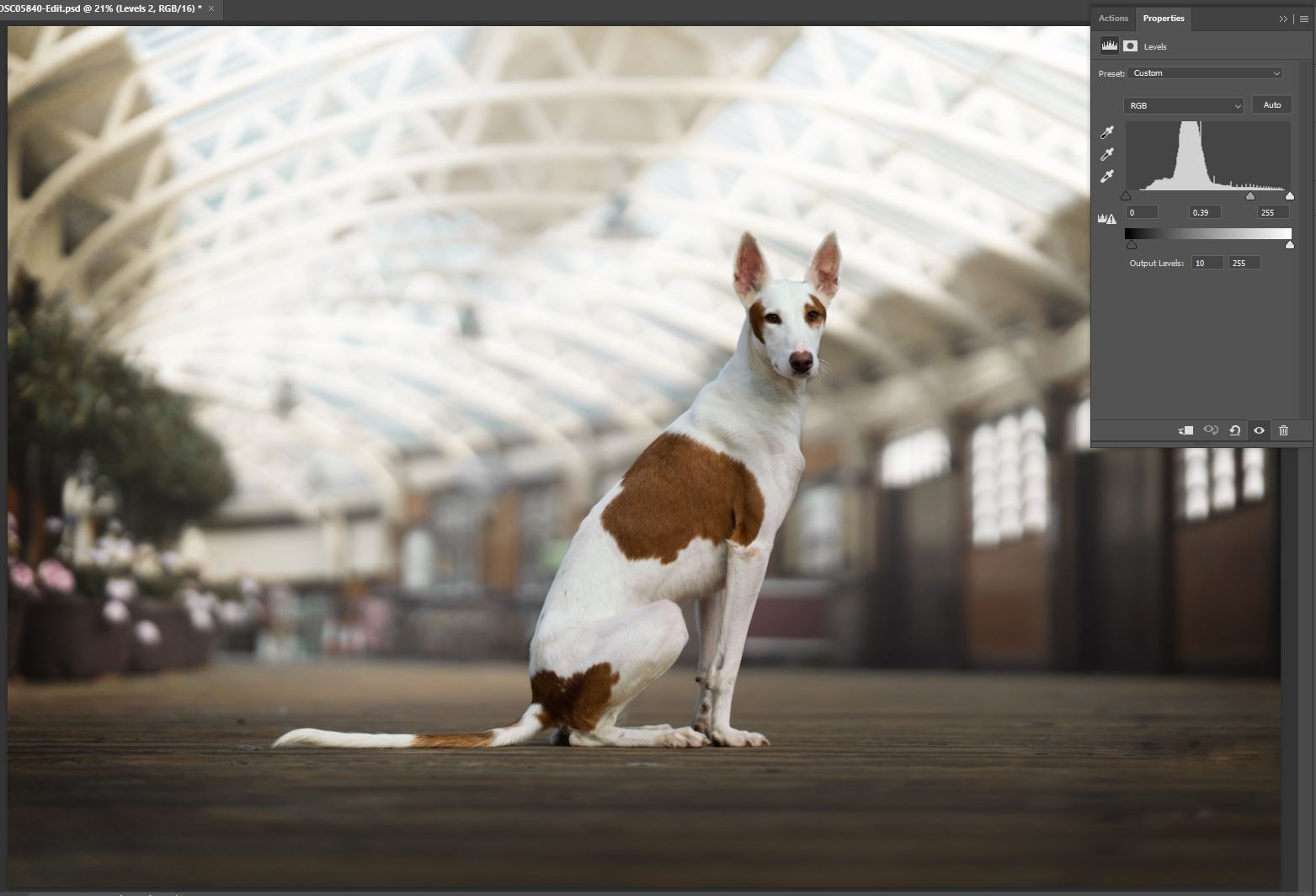
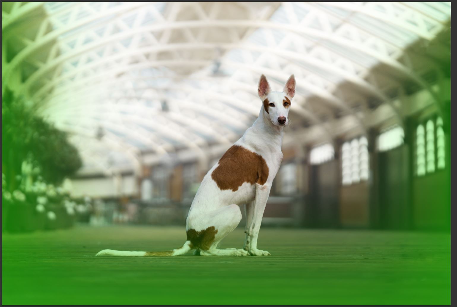
I add new Levels adjustment layer and create a mask around the edges and the bottom section of the image (see screenshot showing masked areas in green). I modify the Levels by moving the midtones (middle triangle) to the left, to darken the area. You can try adjusting the shadows (left hand side triangle) and moving it to the right as well for a stronger effect. I sometimes clip the shadows just a bit by adjusting the bar at the bottom – this controls how dark the darkest colours are.
As the last step, I apply the Orton Effect. I explained how to apply it im my previous tutorial, which you can find here along with a free Photoshop action to download.

Editing the dog - eyes and contrast
The step of this tutorial is adjusting the brightness and contrast on the dog and making the eyes bright and sparkly. As mentioned in the beginning of the tutorial, I usually create two folders – Background and Dog folder with masks applied on them, to be able to add adjustment layers to the subject and background easily. The following adjustment layers will be added to the Dog folder, so all the effects will be applied to the dog only.
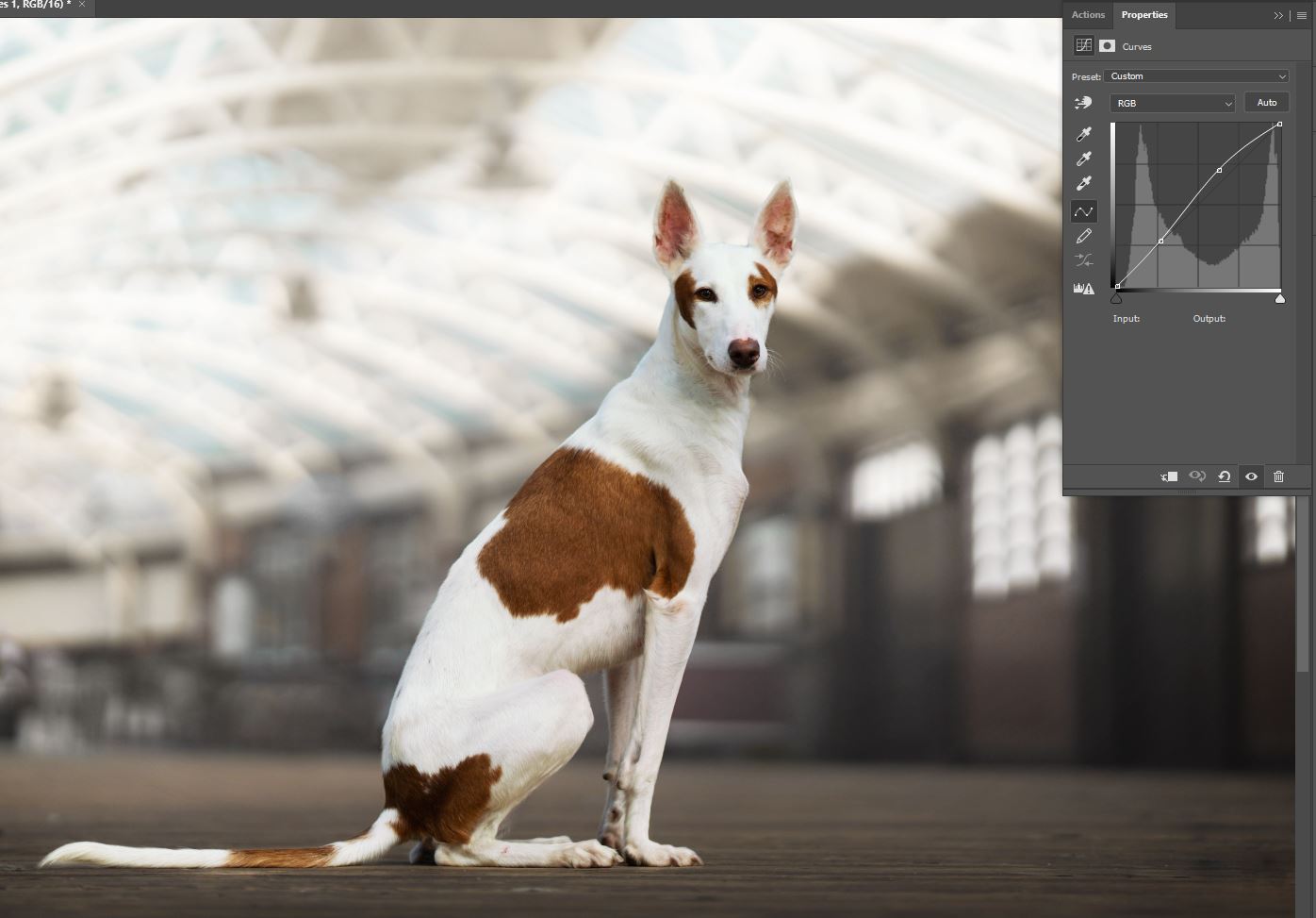
First, I add a new Curves layer and set it up in an “S” shape. I lift the curve on the right, to make the bright parts brighter and lower it slightly on the left side, to make the darker parts darker. Basically, I’m applying contrast and I’m making the dog slightly brighter, so it’s separated from the background. I prefer using Curves over Contrast as it gives me much more control.
The very last step is adding contrast and brightening the eyes. I like to use Levels adjustment layer with blending mode set to Luminosity. This way, when I’m making adjustments to the eyes, only the brightness is affected but saturation and hue stays the same, which seems to be working the best in most cases. Mask the eyes only and add a bit of contrast and brightness by moving the highlights and midtones (the middle and right hand side triangle) to the left. You will need to play around with the sliders a bit and zoom out occasionally to see how it looks like.


That’s the end of the tutorial. I hope you’ve learnt something and I would love to hear any feedback you have about the format and topic of the tutorial. If you would like me to create a tutorial or post editing tips – about editing or photography in general – let me know!